Since starting as Digital Projects Librarian here at the Historical Medical Library of the College of Physicians of Philadelphia, one of my jobs has been to create new interpretive online exhibitions featuring unique aspects of our collections. Digital exhibitions are a great way to bring life to collections and to promote your institution. However, many exhibitions based on just text and images fail to be engaging in our age of constant clicking and easy distraction.
A plethora of articles exist showing that people do not engage with text online the same way they might if they were reading a book or a print article. Simply type “how people read online” into your favorite search engine and you’ll see headlines like, “How People Read Online: Why You Won’t Finish This Article” from Salon, or “Myth #1: People Read Online,” from the user design blog UXMyths. Indeed, a study by Jakob Nielsen, a prominent web usability expert, which tracked readers eyes as they read online, showed that only about 20% of the words of an average online text were actually being read. Studies like this show that online readers scan and click.
If you or your institution are going to be putting the time and effort into creating digital content around your collections, it is worth thinking about how to create digital exhibitions catered to people’s online behavior. Luckily, people in the digital humanities world have been thinking about this problem and have created tools for content creators to more easily build interactive and engaging exhibitions. I will be highlighting two such tools that I used in the creation of our last two major digital exhibitions.
Neatline
Mapping is an increasingly popular way of creating engaging online content. Data-driven journalism employs this method quite frequently. You have probably encountered news stories about issues like text. Or perhaps you have read a human-interest story about refugees in which the route of their migration is presented in such a format. These presentations may feel out of reach for you if you are on your own or part of a small institution, but thankfully the Roy Rosenzweig Center for History and New Media has created a free, open-source application for telling just these sorts of stories.
Neatline is described as a “geotemporal exhibit-builder that allows you to create beautiful, complex maps, image annotations, and narrative sequences.” It functions as a plugin for the common digital library platform Omeka, created by the same team, which allows creators to import digital items with full metadata into the exhibition. Additionally, images such as historical maps can be displayed on top of the map layers in an accurate position by geo-referencing the images. This blog post is too brief to go into the details of the full functionality and uses of Neatline, but I encourage you to spend some time looking at the demo exhibits provided on their site for some inspiration.
When thinking of how we could create an exhibit to honor the one-hundredth anniversary of the US entry in World War I, we turned first to our collections for inspiration. One of our largest collections related to The Great War is the George Outerbridge papers (MSS 2/138). George Outerbridge, a Fellow of the College of Physicians of Philadelphia and a physician who served in WWI, left over seventy letters and postcards dated 1917-1919 and an album of 400 photographs, which Outerbridge quite fortuitously labeled with their location, or, in other words, with geographic data. From this information, and through his letters, we created the exhibition Travels with Outerbridge.
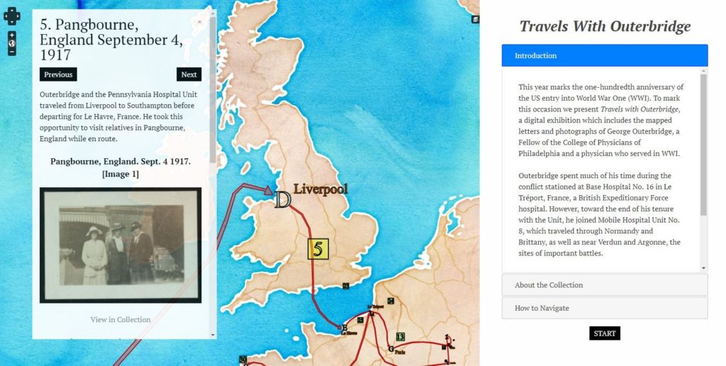
When working with Neatline, it is important to think about the scale of your exhibition and the granularity of your geographic data. In creating Travels with Outerbridge, I originally wanted to use a beautiful historical map of World War I France, which we have in our collection, as the background layer. I spent many hours learning basic ArcGIS geo-referencing and uploading the image to a geoserver, only to realize that to tell Outerbridge’s story I would need to start with his time in the US and England, making the historical map layer which only covered France clunky.
Additionally, I originally intended to place the photographs individually in locations, but quickly realized that since the location data was limited to simply a place name, it would be erroneous to attach the image to a coordinate. These factors led me to the decision to guide readers using hand drawn arrows as well as “Previous” and “Next” navigation buttons since it was easy to get lost dragging the map when zoomed out to larger scales. I additionally removed some of the built-in navigation features known as waypoints, since, once again, at this scale, they actually cluttered the screen and inhibited easy navigation.
Scalar
Scalar is an online scholarly publishing platform that allows creators to pull content from existing digital repositories (including Omeka sites) and combine it with rich text in a narrative “book.” What makes Scalar books different from traditional text and image-based digital exhibitions is that they are nonlinear, using “paths” to allow the reader to explore a variety of interconnecting ideas, as opposed to simply reading from beginning to end. This seemed like the perfect platform for the digital companion to our onsite exhibition at the Mütter Museum, Imperfecta, which examines shifting perspectives about abnormal human development beginning in the 16th century and proceeding through the early 20th century.
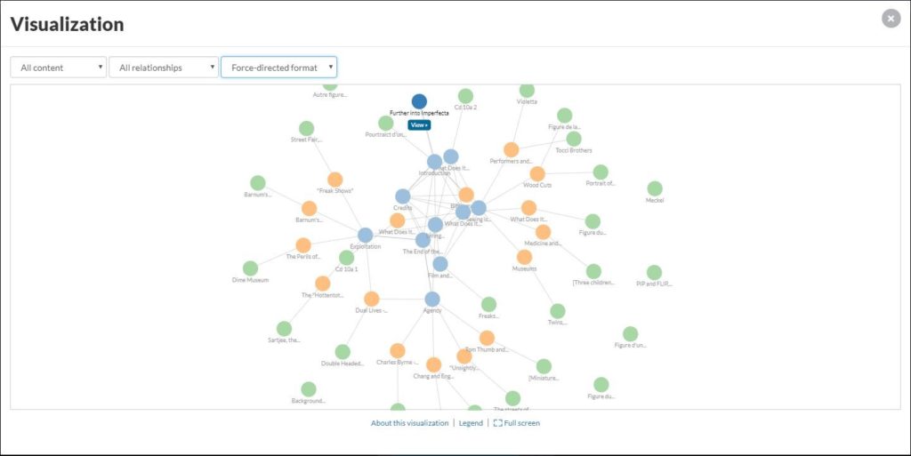
Pictured above is a graph model of our digital exhibition, Further Into Imperfecta. It shows the way in which the paths, pages, and media in the exhibit relate to each other. Starting from the launch page, readers are able to follow any of these vectors weaving through connected ideas based on the whim of their curiosity. This might seem a little obtuse, but in practice, it works quite seamlessly, and indeed we have seen in our web traffic analytics for this exhibition that, even though it is rather text heavy, users are actually spending a good amount of time on the site visiting many pages with each visit. Go ahead, try it out yourself.
One thing I haven’t discussed yet is the barrier to entry for these platforms. Neatline requires Omeka, which, though it exists in a hosted form, often requires you or someone at your institution to install the software on a web server and to administer that server over time. Scalar, however, does not require this. Depending on your use case, creating a Scalar account online and creating your book through their servers may even benefit your book by allowing readers to comment on and make connections to your published work, with minimal coding required.
In our case, we decided to install our own copy of the Scalar software on a server to do customizations that would not have been possible in the hosted version. Additionally, since Scalar is non-linear, the Further Into Imperfecta exhibition is planned as an ongoing work, with some minor additions in the works, such as posting the videos from a recent symposium. Another full set of paths will be released toward the end of this year exploring beliefs held throughout medical history about how a mother’s thoughts and intentions affected fetal development.
What collections do you have or know about that might be presented via an interactive map? What topics does your institution support that might benefit from either a nonlinear exploration or through collaborative scholarship? What are other considerations you might need to make while thinking about presenting these materials? If you need help getting started with any of these platforms, or simply want to talk shop, feel free to e-mail me at tdahn@collegeofphysicians.org.